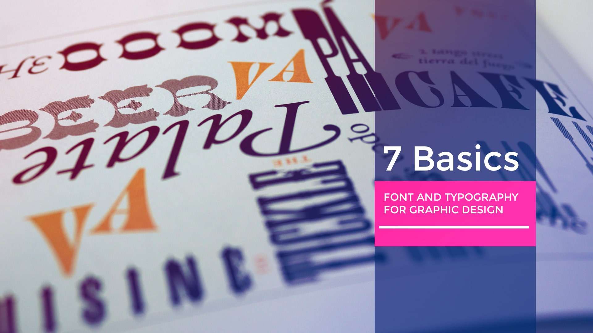
If you’re like most people, you probably don’t think much about font and typography when you’re designing something. But trust me, paying attention to these things can make a world of difference when it comes to creating a design that looks great and communicates your message effectively. In this article we will tell you about 7 Basics Of Font And Typography to Create Stunning Graphic Designs.
points to keep in mind While working with Font and Typography
1. Choosing Right Font
Choosing a font can seem like a daunting task because there are so many options. But don’t worry, take a deep breath and think about the mood you want to convey. Do you want your designs to look modern and edgy or classic and sophisticated? Once you have a general idea, it becomes easier to narrow down the options and find a font that meets your requirements.
2. Keep it Simple
Now, I know it’s tempting to use all sorts of fonts and styles in your designs, but it’s usually best to keep it simple. Use no more than one or two fonts and use them consistently throughout the design process. This will help create a sense of unity and make it easier for your audience to read and understand your message.
3. Use Contrast
Contrast is like the spice of typography. It can make your design pop and attract attention. So experiment with light and dark backgrounds, bold and thin fonts and see what works best for your message. But don’t overdo the contrast, otherwise your text can become difficult to read.
4. Consider Hierarchy
Hierarchy focuses your audience’s attention on the most important information. So if you want to emphasize a certain word or phrase, make it bigger or bolder than the rest of the text. Think of it as creating a map for the eyes of the beholder.
5. Pay Attention to Spacing
Spacing may not be the sexiest aspect of typography, but it’s crucial to making your design readable and easy to see. If you pile up too much text, it will be hard to read, and if you use too much space, it will look messy. So experiment with spacing until you find the right balance for your design.
6. Stick to Standard Fonts
While you might want to use a fancy, decorative font, it’s usually best to use standard fonts like Arial, Times New Roman, or Helvetica. These fonts are designed for optimal legibility and legibility, making it easier for your audience to read and understand your message.
7. Consider Your Medium
Finally, remember the medium you want to use for your design. Different media have different font format and size requirements. For example, if you’re planning for social media, you can use a larger font size or a bolder font to make sure it’s readable on small screens.
By Implementing the above basics on font and typography, you will definitely create an amazing design. Utilizing this concept will improve your design, content readability, proper use of spacing, and another design aspects.
Types of Fonts and How to Use
There are many types of fonts available, and understanding their characteristics and appropriate uses can help you make informed choices when creating a design.
There are four main categories of fonts: serif, sans-serif, script, and display. Each type has its unique features, and choosing the right one can help convey the intended message more effectively.
Serif fonts have small lines or flourishes at the ends of their strokes. They are traditional and classic, making them great for conveying a sense of authority, formality, or elegance. Examples of serif fonts include Times New Roman, Georgia, and Baskerville.
Sans-serif fonts are clean and modern, without the decorative lines or flourishes of serif fonts. They are often used in digital media, such as websites or mobile apps, due to their legibility at small sizes. Examples of sans-serif fonts include Arial, Helvetica, and Verdana.
Script fonts are designed to look like handwriting or calligraphy. They are often used for special occasions or to convey a sense of elegance, romance, or whimsy. However, they can be challenging to read at small sizes, so they are not suitable for body text. Examples of script fonts include Brush Script, Edwardian Script, and Lucida Calligraphy.
Display fonts are unique and eye-catching, intended to grab attention and convey a sense of personality or fun. They are often used for headlines or titles, but they can be difficult to read in long blocks of text. Examples of display fonts include Impact, Comic Sans, and Lobster.
When choosing a font, it’s essential to consider the message you want to convey and the context in which the design will be seen. For example, if you are designing a logo for a law firm, a classic serif font might be appropriate to convey a sense of tradition and professionalism. However, if you are designing a logo for a tech startup, a modern sans-serif font might be a better choice to convey a sense of innovation and progress.
Frequently Asked Questions
Typography is the art and technique of arranging type to make written language legible, readable, and appealing when displayed.
Serif fonts have small lines or flourishes at the ends of their strokes, while sans-serif fonts do not. Serif fonts are more traditional and formal, while sans-serif fonts are more modern and casual.
It’s generally best to use no more than two or three fonts in a design. Using too many fonts can make a design look cluttered and unprofessional.
Leading is the vertical spacing between lines of text, kerning is the adjustment of space between individual letters, and tracking is the adjustment of space between all the letters in a word or line of text.
Logo font actually depends upon your business. If your business branding reflects more modern and minimal then you should consider Sans Serif fonts. But if your business shows feelings of elegance and tradition then Serif fonts are the best choice.
There are many websites that offer free fonts, such as Google Fonts, Font Squirrel, and DaFont. However, be sure to check the license terms before using any free fonts in a commercial project.
Through Google Fonts, you have free access to hundreds of open-source fonts.
- Go to https://fonts.google.com/
- Either in the Text panel or the tool options bar, click the font’s name.
- Opening of the font menu.
- Click More fonts… at the bottom of the font menu.
- The Google Fonts catalog begins to load.
- Go to the bottom of the list and scroll down to load more fonts.
- Use the filters to focus your search results by entering the font name in the search field and pressing Enter.
- You can choose the fonts you want to use. The list of added fonts on the right includes them.
- Click OK once your choice has satisfied you.
- The font menu for this document now includes the added fonts.
Common typography mistakes include using too many different fonts, using fonts that are difficult to read, failing to consider legibility in different contexts, and using inappropriate font choices for the purpose and audience of the design.
Conclusion
In conclusion, font and typography might not be the most exciting aspect of design, but it’s definitely one of the most important. By following these tips, you’ll be able to create designs that look great, communicate your message effectively, and keep your audience engaged. So, go forth and conquer the world of font and typography!
Check out our other Blog